GroundsKeeper
Brand Identity
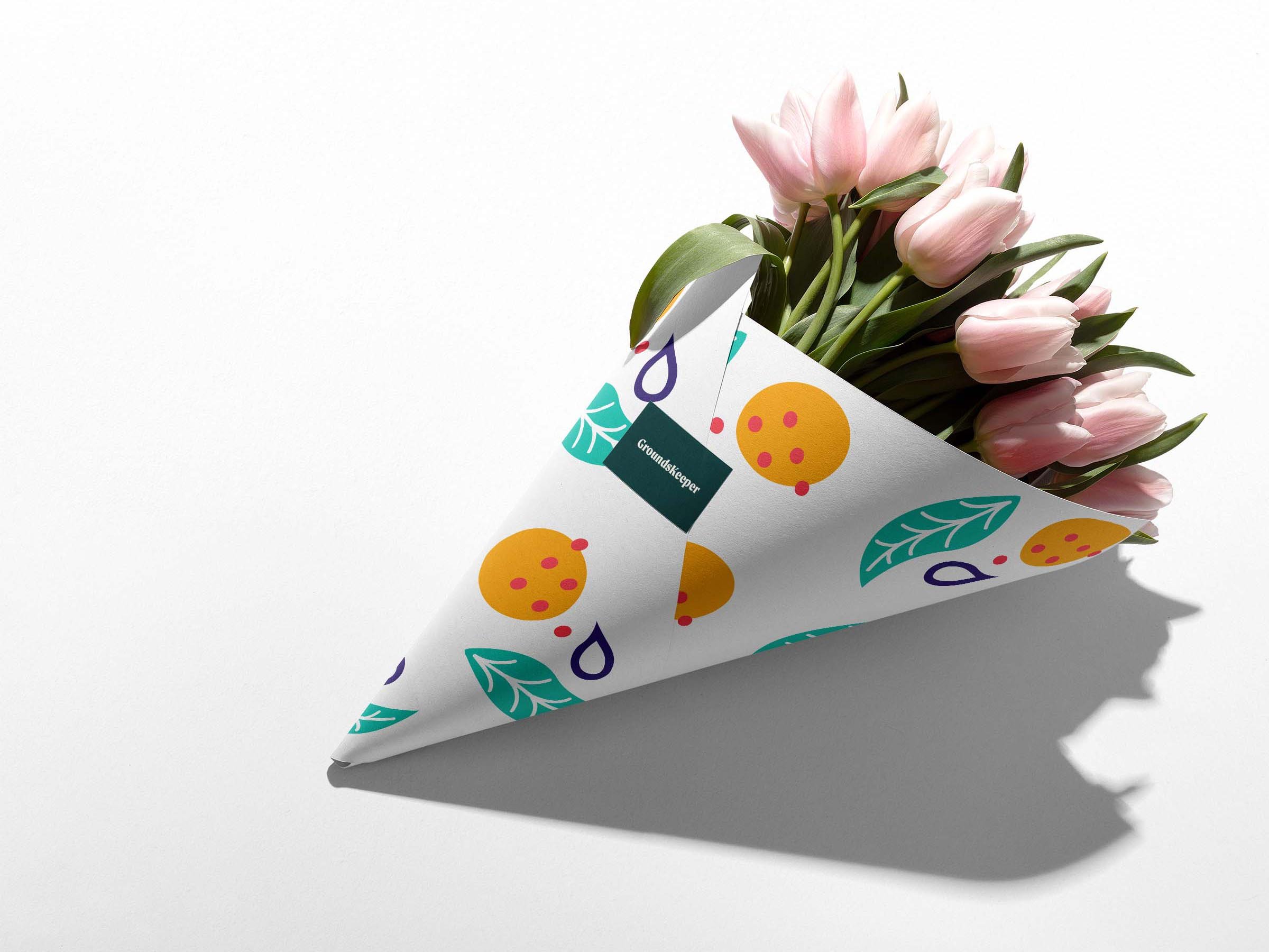
I developed a brand identity for GroundsKeeper, a flower shop cafe, and documented the brand’s styles in a style guide. I used this guide as a jumping-off-point for designing merchandise, marketing materials, and packaging.
Styles

Logo Variations

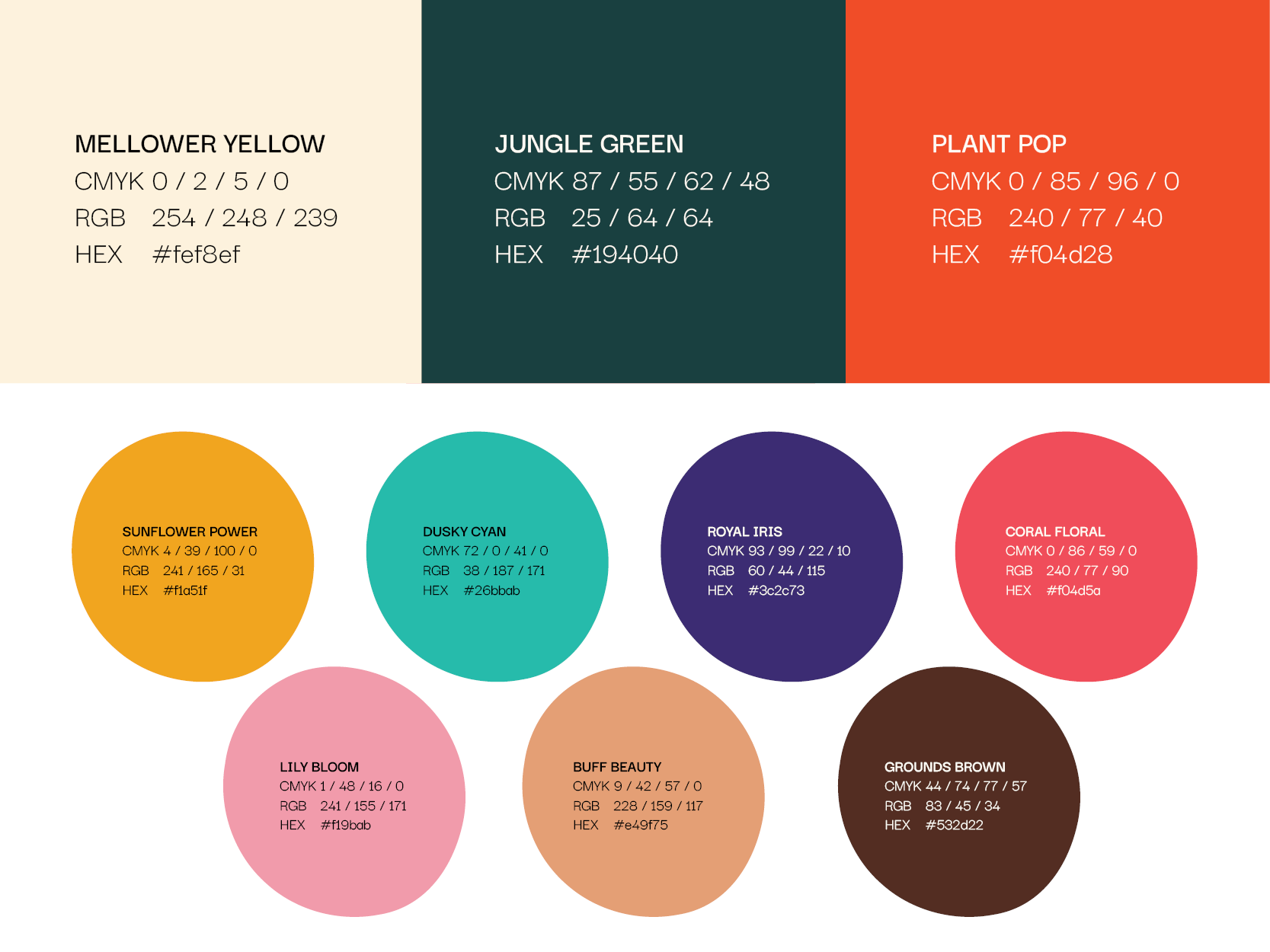
Color Palette

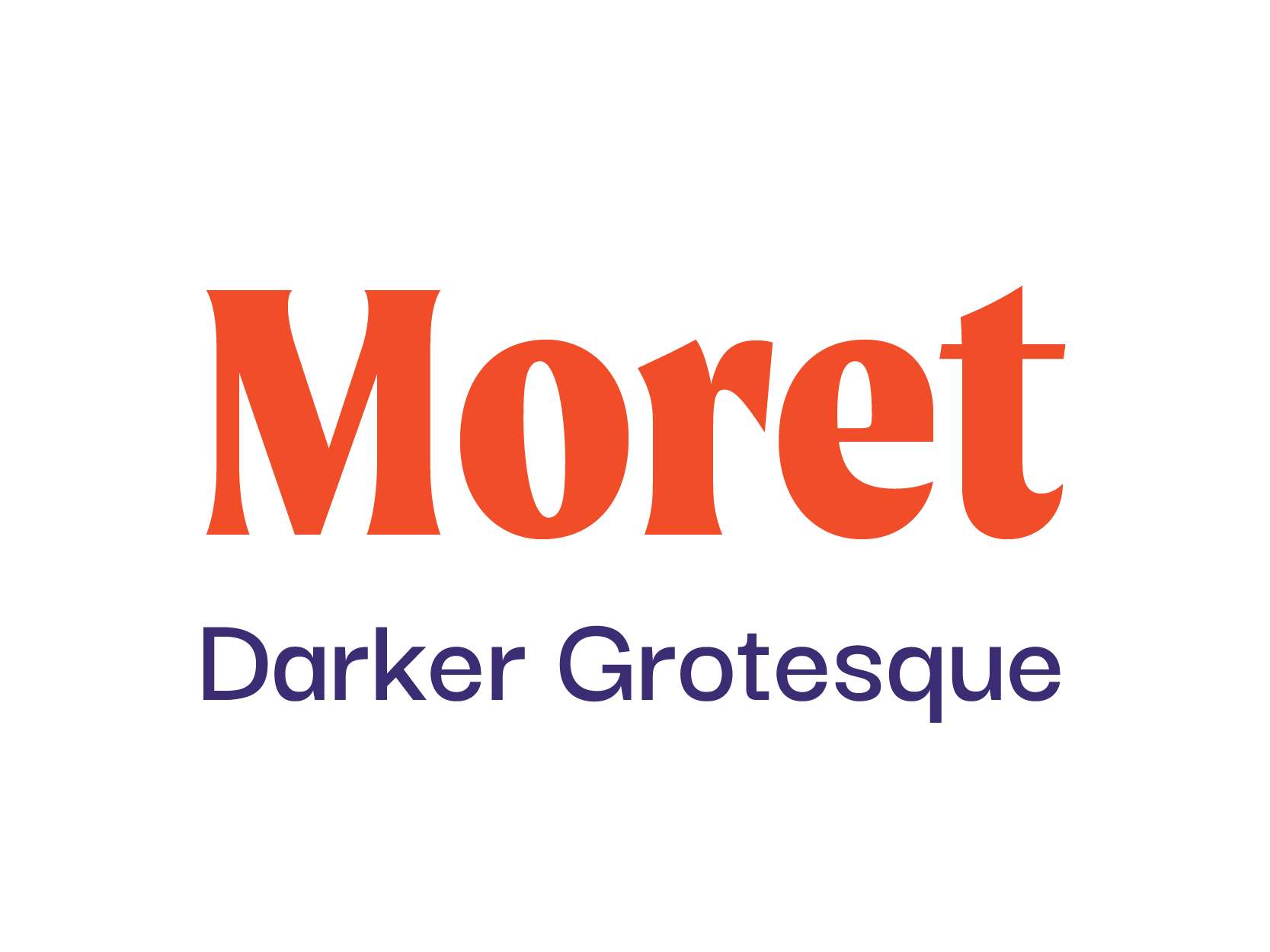
Typefaces

Shapes

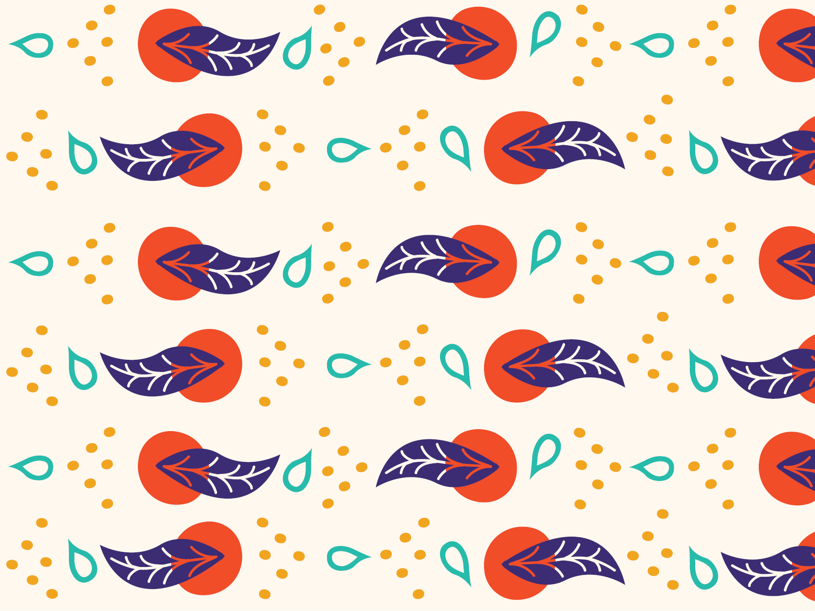
Pattern
Scroll down to see the how I applied these styles to different touchpoints, or view the whole brand style guide (PDF).
Branding Applications


Concept
GroundsKeeper is a nurturing, cozy, peaceful, cheerful spot below the protective shade of the plant canopy.
GroundsKeeper’s branding uses dark backgrounds and bright pops of color to evoke the space’s jungle aesthetic and the safety, cheer, and coziness of spending time beneath a leafy canopy.
Moret, the display type used for the logo, brings to mind old handmade signs and the comfort of entering a welcoming neighborhood business.
The versatility of the brand’s shapes - the leaf, the grounds, the sun, and the drop - allow for lush surfaces that signal a plant filled space.
Keep reading to discover my design process and sketches…
Brief
Flower shops and garden stores are often verdant, peaceful spaces, but shoppers never get a chance to sit and savor the atmosphere. GroundsKeeper is a cozy space that allows them to sit and soak in the vibrant plant life while drinking a coffee or a tea. Customers can buy houseplants, seeds and transplants for outdoor gardens, and a premium selection of local, native bouquets.
People of any age who like plants should feel comfortable here. People of all gender identities are invited to the space.
The goal is to make GroundsKeeper seem welcoming and safe, and to signal its uniqueness as a two-for-one deal: flower shop and cafe.
Research Insights
In my research, I discovered some beautiful flower shop cafes in the U.S. and abroad, but they seem to be few and far between. Their interiors and branding are usually minimalist, white, and light-filled.
Then I started exploring coffee branding, coffee shops around the world, and environments where coffee is grown, and a jungle theme began to emerge. I realized that in a forest or jungle, the plants at the top receive light, but the space below is filled with shadow, with bits of light peeking through.
GroundsKeeper can differentiate itself from other flower shops and cafes by creating darker branding with pops of color, imitating the feeling of being protected by a forest canopy.
Moodboard
The moodboard shows the play of light and shadow and bright on dark that creates the cozy, verdant jungle atmosphere of GroundsKeeper.
Logo Sketches
My logo sketches explored light, shadow, shade, protection/safety, plants, coffee cups, and other natural elements. I experimented with different ways to connect all of the elements.
Digital Drafts
I found in my research that coffee shop logos often don’t have anything to do with coffee, but garden supply and flower shop logos often do relate to the products they’re selling. I decided to stay mostly literal with my drawings, using imagery that’s explicitly tied to plants and coffee.
Reflection
I enjoyed this project because I have always dreamt of creating or just simply visiting a flower shop cafe. The flower shop cafe in my imagination was nothing like how GroundsKeeper turned out. When I let myself follow the threads of my research that really sparked excitement, it led to something unexpected that I hadn’t seen or imagined anywhere else. I’d love to design more dishware to be used in the cafe, and keep experimenting with all of the different ways to mix the colors and shapes to create new patterns and new moods. I want to make more repeating patterns, too.


