Fantastic Fest
Event Poster and Branding
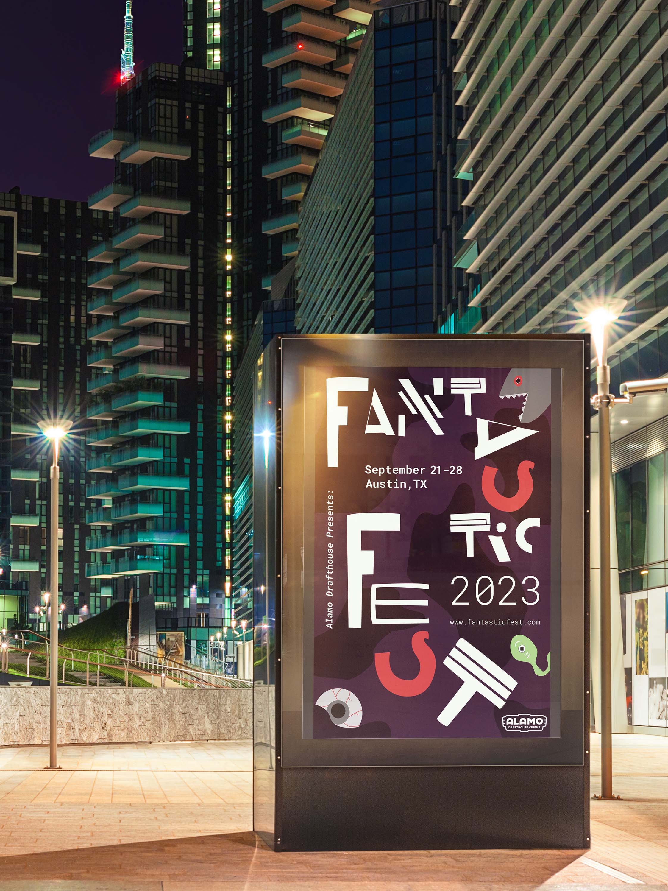
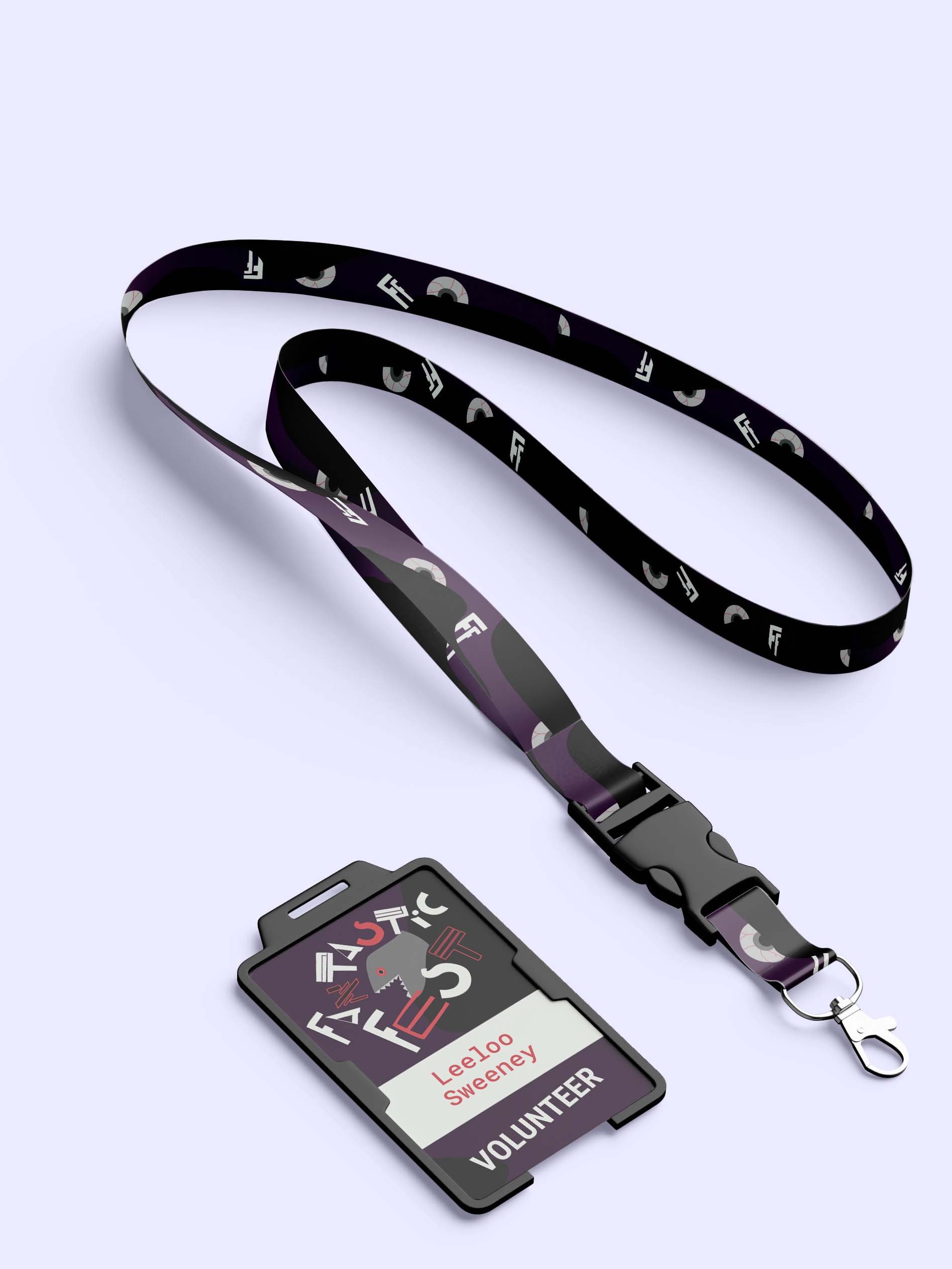
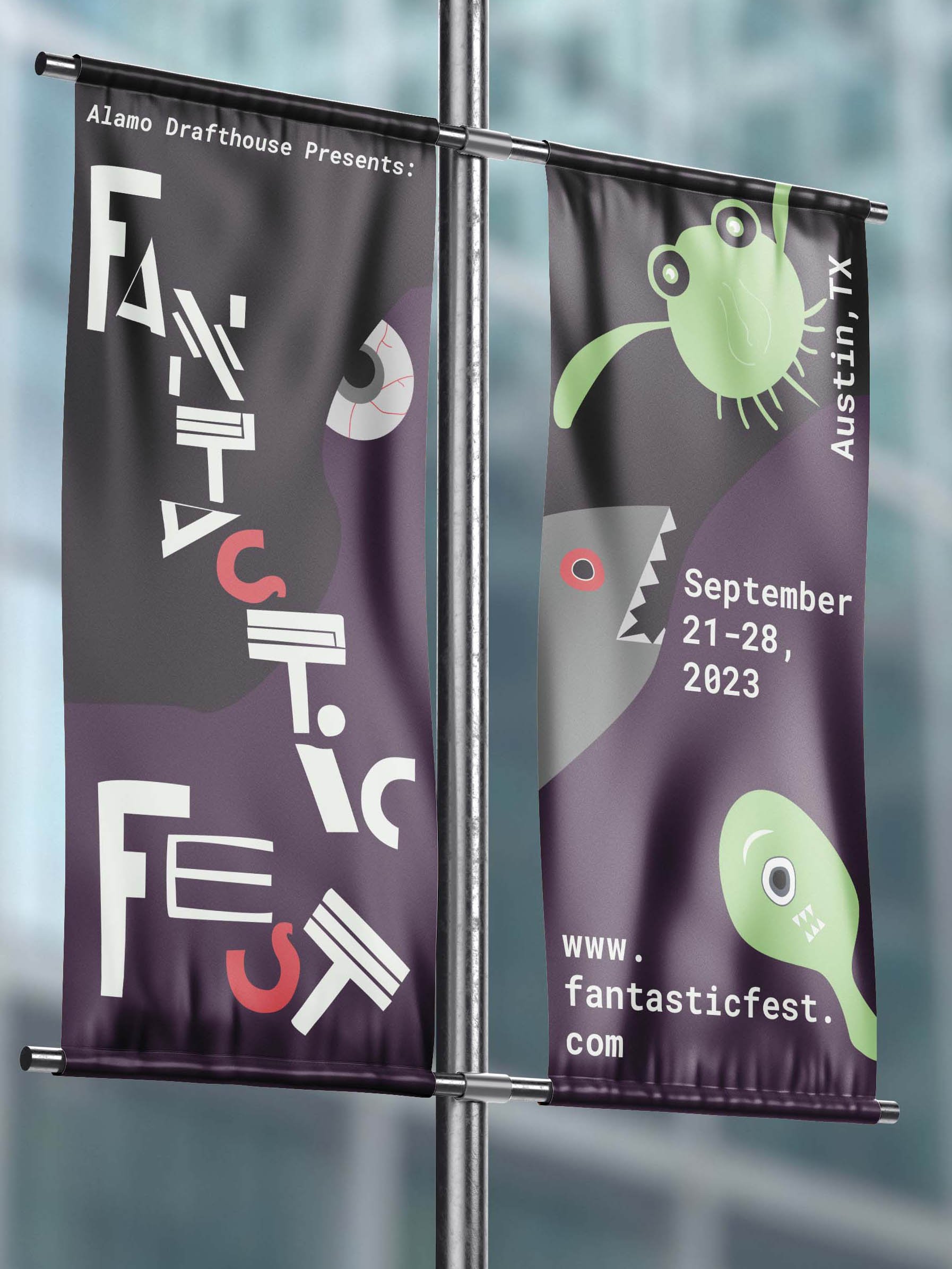
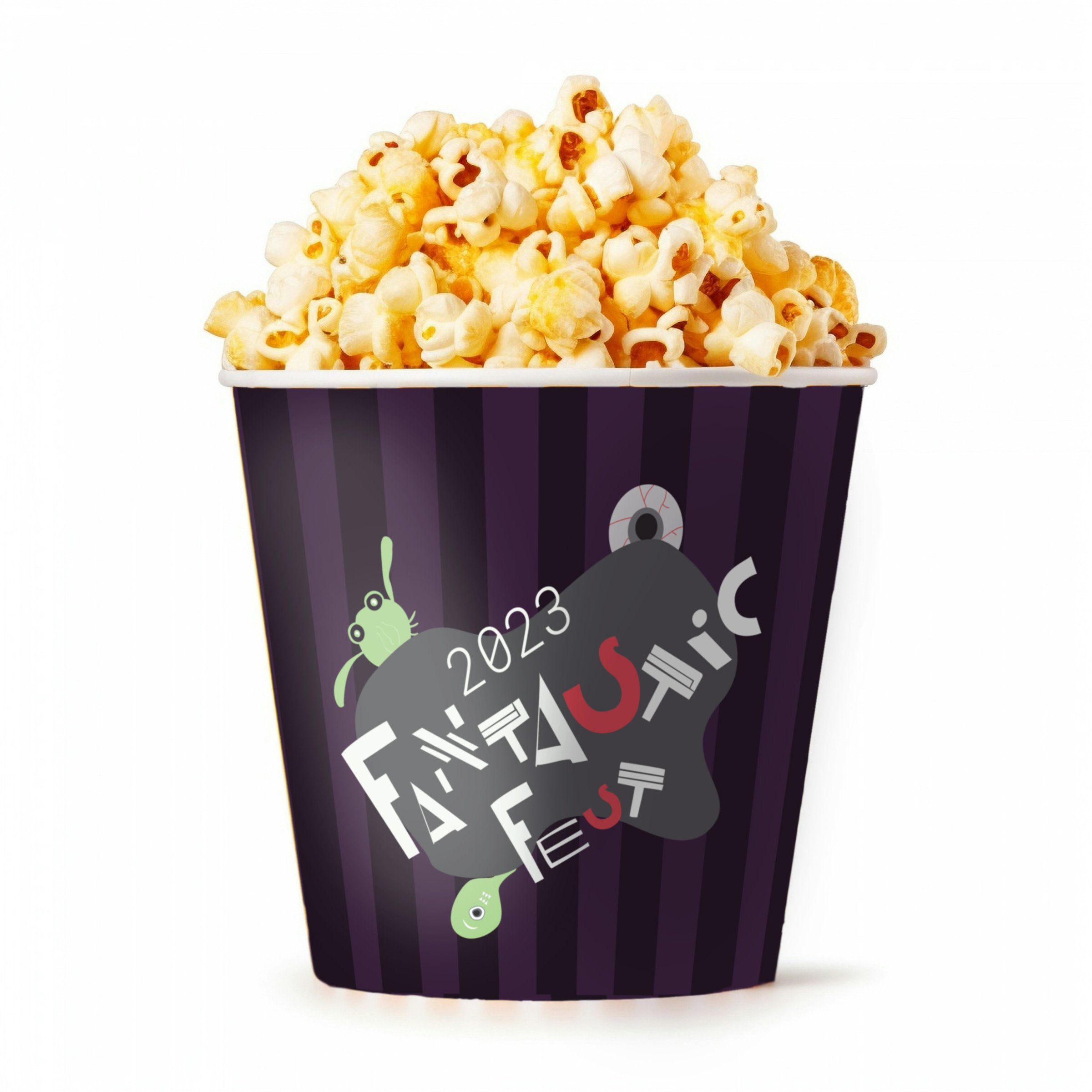
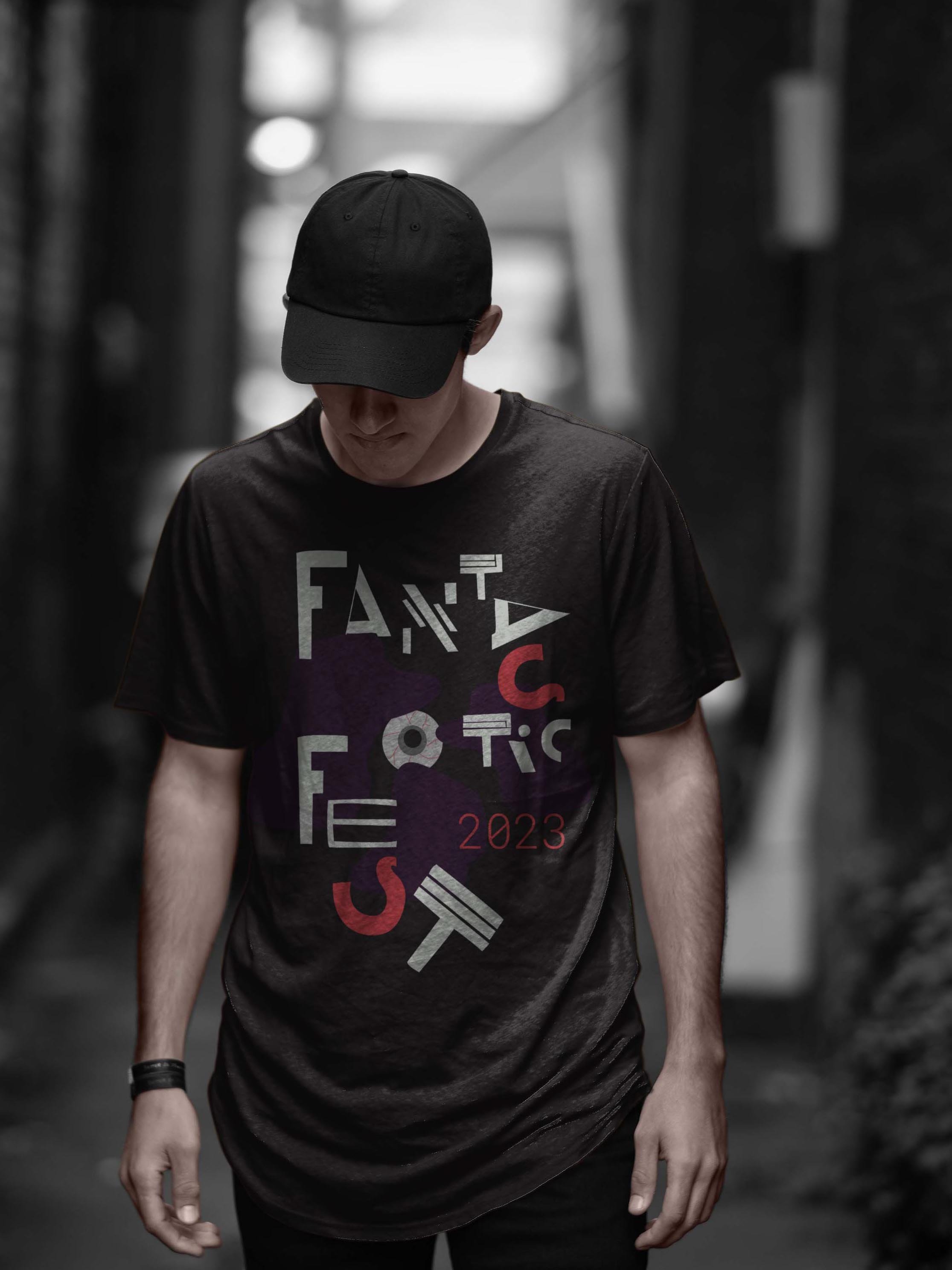
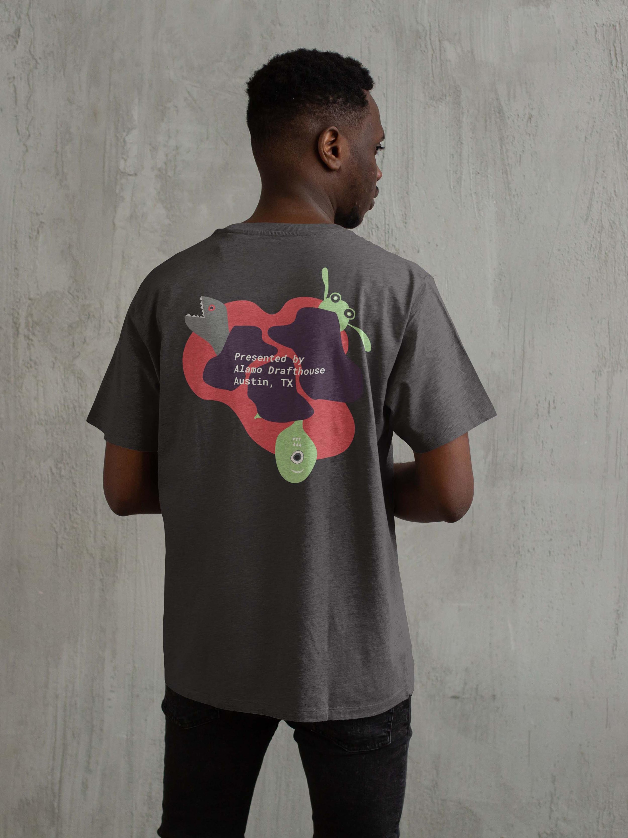
I developed a typographic poster for Austin-based genre film festival Fantastic Fest, and then applied the styling of this poster to branded merchandise, signage, and publications.
Styles

Color

Type & Lettering
Shapes and Creatures
Poster Design

Design Applications
Concept
The Fantastic Fest 2023 mood is dark, a little scary, and a little playful, celebrating the shadowy and fantastical imaginations of filmmakers and film fans.
The final design uses slightly chaotic and off-kilter Dada-inspired hand-drawn lettering in different configurations to create visual interest, dynamism, and playfulness. For a film festival with a wide variety of genres and movie-related activities, it makes sense to have varied letterforms. Monospace body text adds a complementary technical touch, reminiscent of old-school sci-fi.
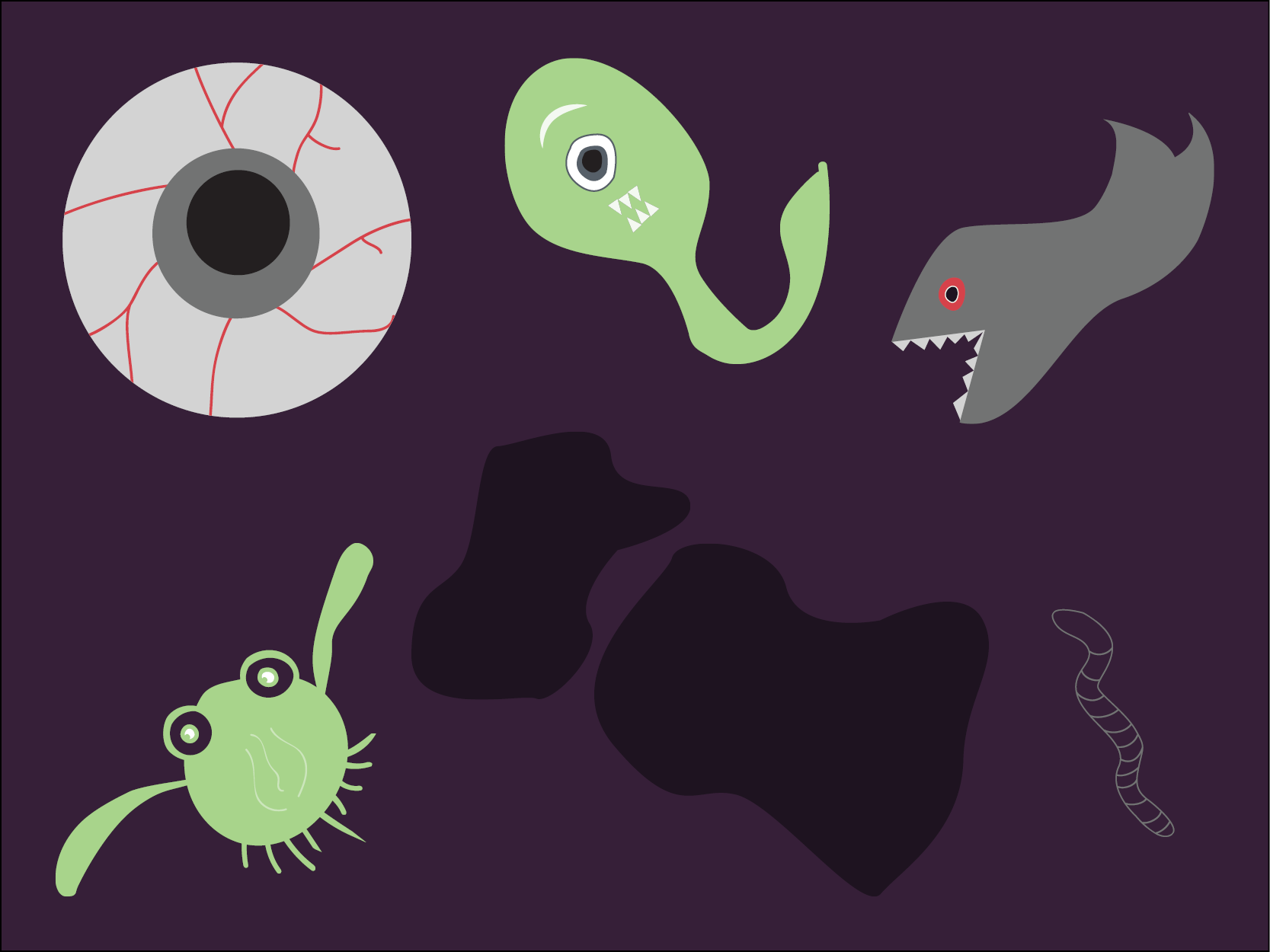
The eyeball appears on all designs to represent movie watching. Other goofy monster drawings lightheartedly evoke sci-fi and horror – threatening with sharp teeth, but still cute and playful.
The simple color palette is inspired by horror (red, varying shades of purple) and sci-fi (bright green).
Read on to learn about my DESIGN PROCESS and EXPERIMENTATION…
Brief
With 8 movie screens, Fantastic Fest is the largest genre film festival in the U.S. and specializes in horror, fantasy, sci-fi, action and overall fantastic movies from across the globe. One of the festival’s goals is to support and promote challenging and thought provoking films and the creators behind them.
The Fantastic Fest audience is a group of nerd-leaning film buffs between 18 and 55 who like to be the first to know about new media and art.
The goal for this poster is to advertise Fantastic Fest to new people who may not have attended before, and to be a collectible for loyal fans. It should be consistent with event branding from previous years in its use of fantastical creatures or monsters.
Research Insights
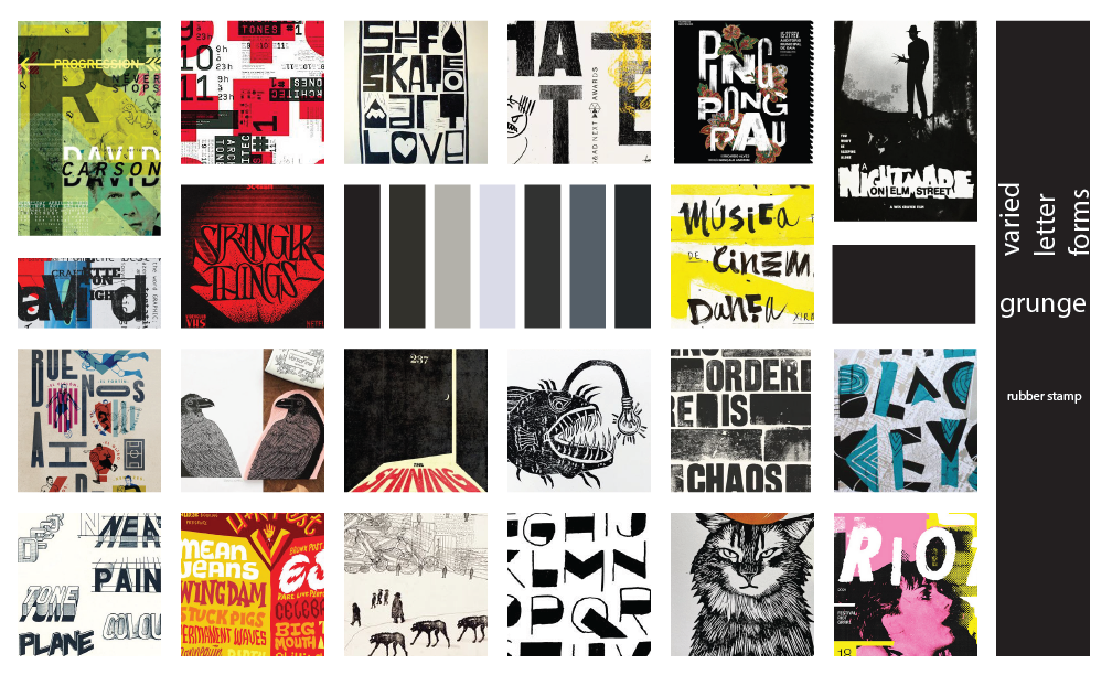
I researched some film festival branding, but my main research was on posters, including many film posters. I looked for designs in a whole range of styles: detailed embellishments, gouache, rubber stamp, grunge, and retro-futuristic. I also researched previous Fantastic Fest art and noticed lots of prominent eyes, in addition to creatures. I was drawn to posters with a lot of variation in letterforms and baselines, and simple color palettes.
Three Moodboards
Rubber stamp
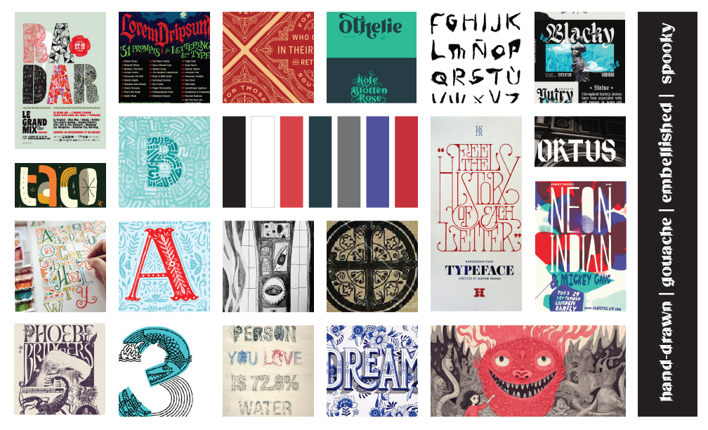
Gouache embellishment

Retro-futurist
Sketches - Round 1
I tried to sketch in the different styles I collected, and imagined as many different kinds of creatures and monsters as I could.
Sketches - Round 2
Lettering Experimentation

I began by creating rubber stamp letters and even tried drawing patterns in pen on top of the stamp. I planned on scanning them and rasterizing the letters, but realized this wouldn't scale for a billboard. I tried scanning the rubber stamped letters and outlining them in Illustrator to make vectors, but this was a lot of steps for an effect not much different than simply drawing the letters.
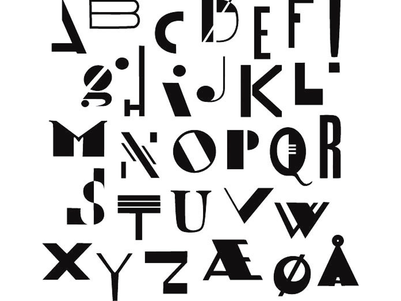
I decided to base my letters off of this alphabet, created by the designer Linnosaurus.

I traced over the letters to test them out. I thought the F and the E were too similar so I created a new E from the B. I decided to simplify the S by tracing the C and adding an extra curl. I also added a left arm to the A to make it more identifiable.
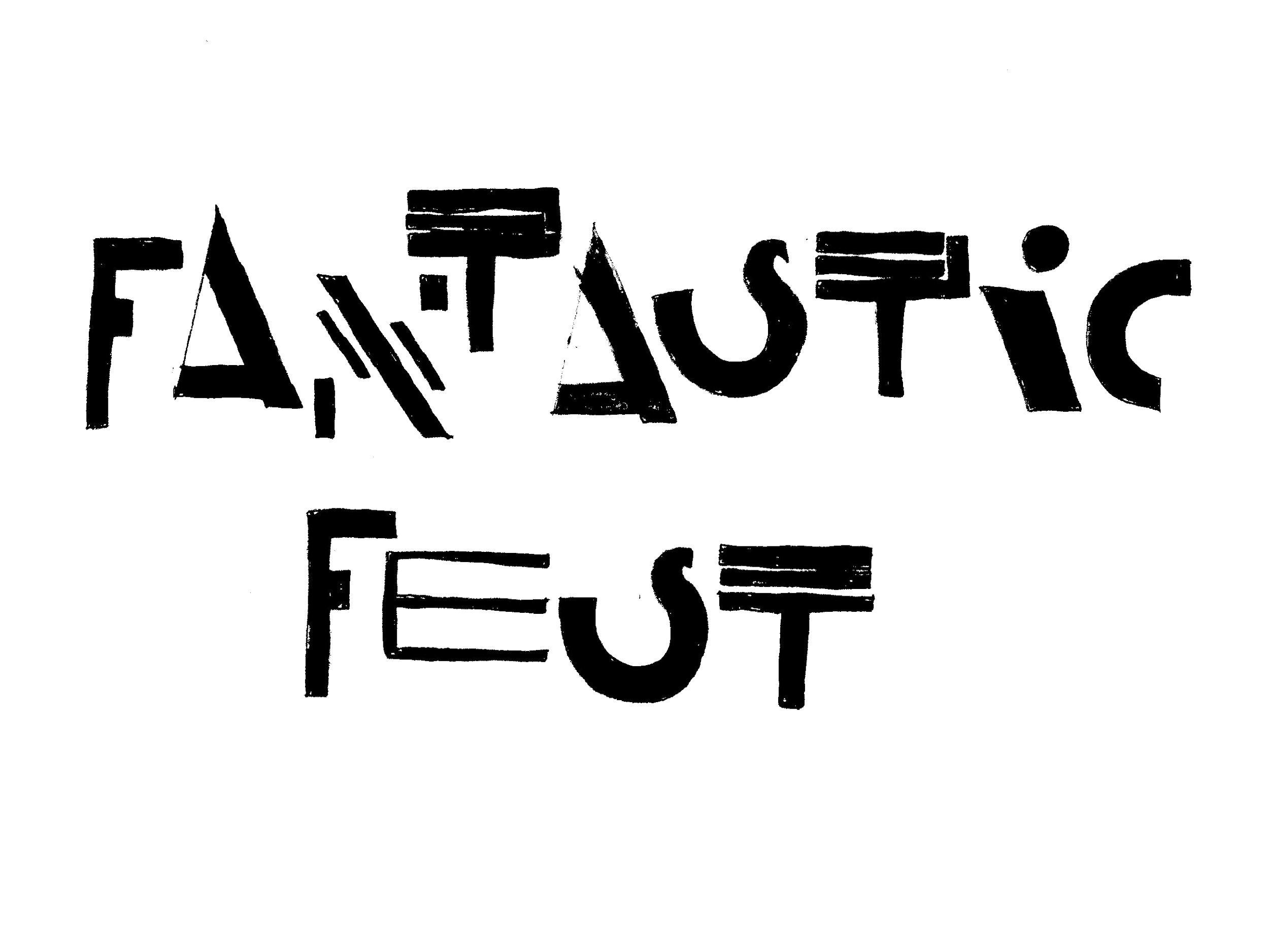
These were the final letterforms I chose. I tried drawing them staggered. After this, I scanned them in and outlined them in Illustrator with a combination of the pen tool and image trace.
Digital Drafts
Challenges
Choosing a concept to move forward with after sketching. It helped to show the poster to other designers for opinions. The poster design I decided to go with worked because the handmade letterforms lent themselves to different arrangements and the creatures could easily fit into different layouts.
Not being able to use rubber stamps for large scale printing. With more time, I could have found a way to mimic the rubber stamp texture on vector shapes in a scalable way.
Reflection
This project convinced me that I will always strive to include a hand-done element in my designs; that is to say, I’ll try to spend time with ink and pencils and paper, and find ways to translate it to my digital work. Tracing and drawing the letters helped them take shape and had a unique result. Doing so many sketches also forced me to imagine and hone my ideas for fun creatures. Placing those little guys in my designs gave me joy.
When I was researching retro-futurism I ran into the vaporwave style and I’d like to do more experimentation with that in the future.
I learned a lot from this project and loved working on it!


