Central Texas Gardener
Brand Refresh and TV Graphics
I worked on a team designing a new logo, visual language, and show graphics for the popular Austin PBS Original show Central Texas Gardener.
Amanda Millwee - Creative Director // Kit Davis - Graphic Designer and Motion Graphics // Terry Jerome - Video Editor // Sarah Sweeney - Graphic Designer
Show Graphics
Concept
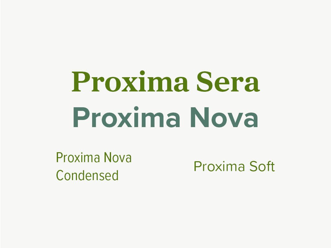
Central Texas Gardener is educational, informative, accessible, curious, conversational, empathetic, reciprocal, and trusted. Proxima Sera, a combination of old-style and modern influences, matches this trustworthy, informative mood, and Proxima Nova also shows that the show fits into the modern lifestyles of its viewers. Both are easy to read at all sizes and offer many weight, width, and smoothness variants, for a wide range of applications (on-air, online, and in print).
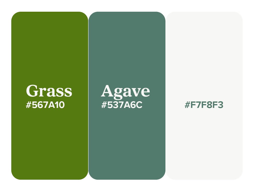
CTG episodes highlight native plants, flowers, insects, pollinators, houseplants, vegetables and food, ponds and water. The brand uses rounded corners to harmonize with the organic, flowing shapes of all of these natural elements.
Styles
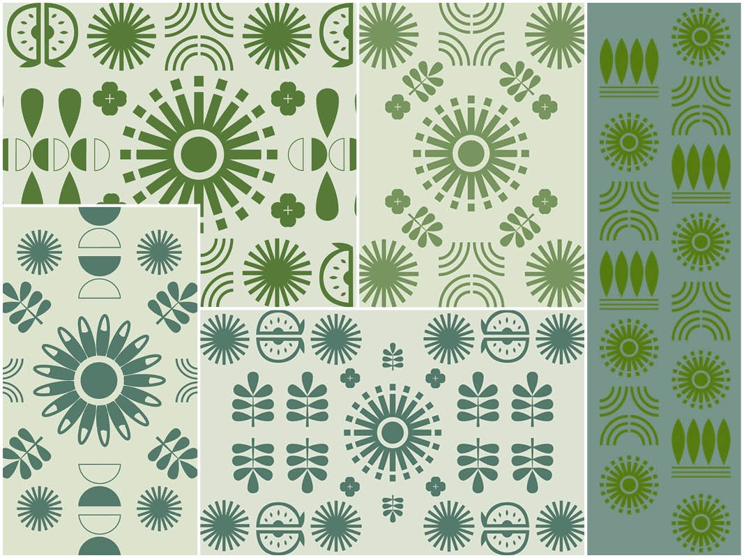
Keep reading to discover my design process and sketches…
Brief
Our assignment was to create a new logo and show graphics (app tile, intro, lower thirds, bumpers, and credits) for the TV show Central Texas Gardener. Central Texas Gardener is produced by Austin PBS and airs across Central Texas and in 8 other states. It has been on the air since the late 1980s.
Central Texas Gardener had been using the same graphics for 10 years, and had been using the agave logo for longer. The graphics began to look outdated and we felt the logo was not instantly recognizable as an agave. When the logo was used as a watermark on photos in the show’s blog, it easily blended into the background.
Moodboard
Logo Sketches & Digital Drafts
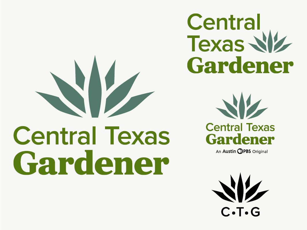
We presented 7 logos total, 2 of which were mine, shown here. The one with the two leaves was a top choice, because it was not too far from the original logo, which was something the production team was concerned about.
Lower Thirds Process
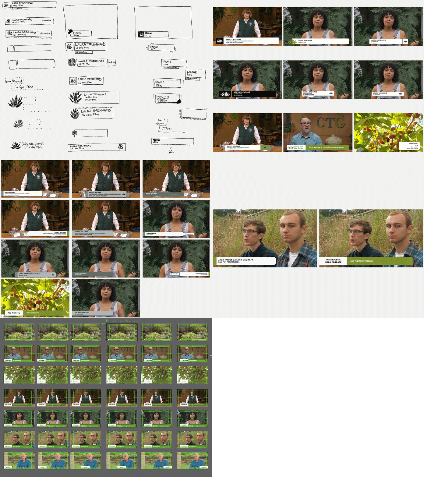
Designs must allow enough space for guests’ varying titles and qualifications, which can get long. I started out in black and white so that I could focus on shapes, contrast, and typography.
We narrowed our options down to 2 layouts and ultimately chose the one with the more distinct hierarchy. Once we decided on the final lower thirds design, I tested them out in all variations, taking different amounts of text and alignments into consideration.
Bumper Drafts

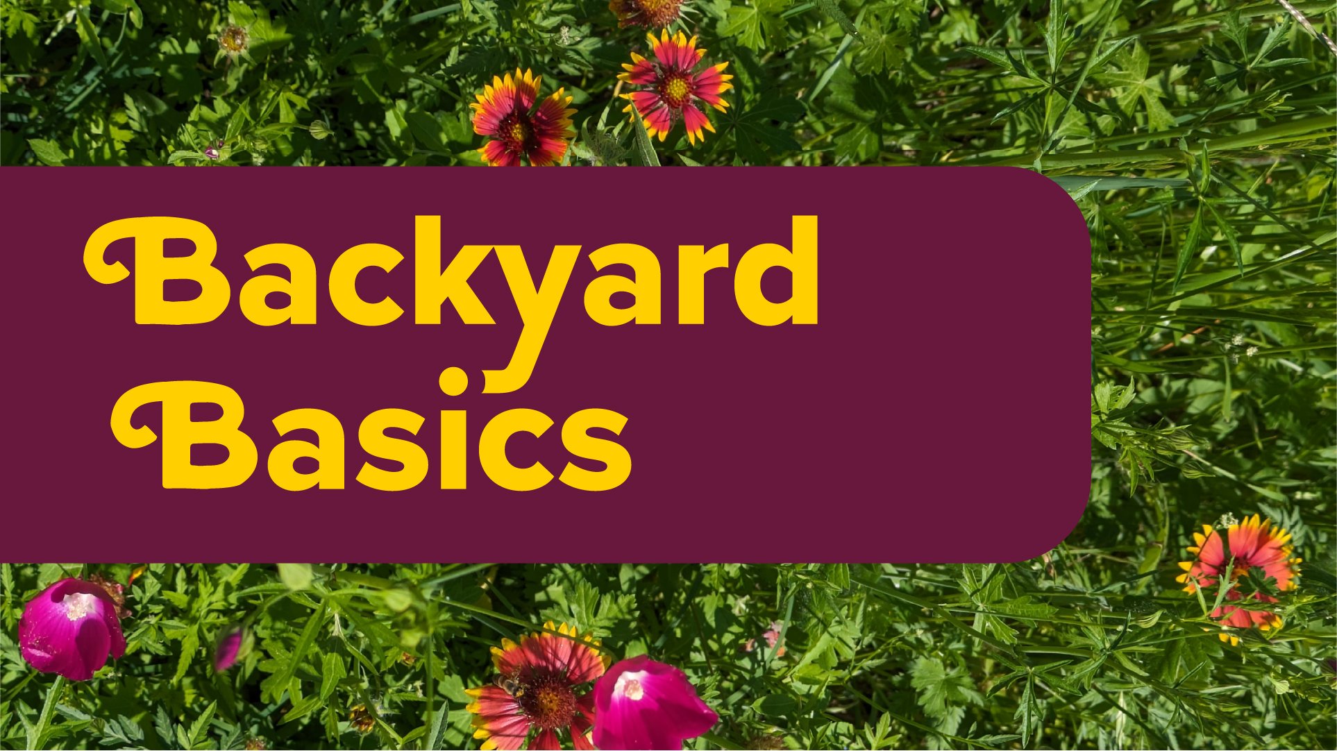
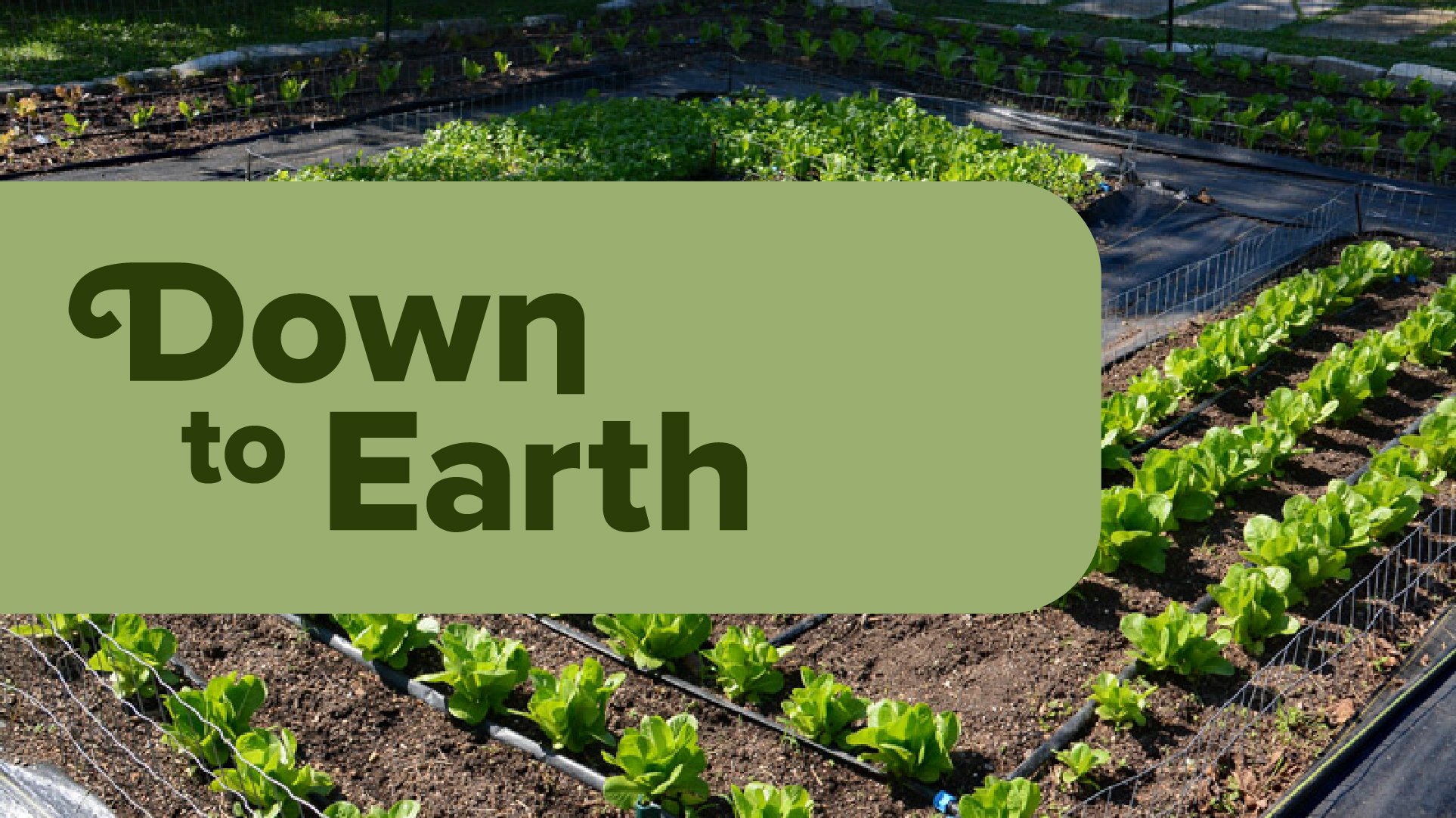

We decided we wanted to use symbols and patterns in the bumpers, and needed to find a style. On top in gray-green are the icons that represent local and native plants. The middle purple icons are more abstract and modern.
My role was to combine these two styles to something that looked modern but also referred to local plants. The burgundy icons are the bottom were the final choice I came up with.
Reflection
It was an honor for me to work for such a longstanding show, on a topic - gardening - that is one of my main hobbies. I was lucky to get the chance to work as a team and see how a project can blossom when members of the design and production team share ideas back and forth and build on each others’ work. Now I know the thought that goes into making TV graphics, and the balance that is required to make the text readable and designs topical, while keeping the programming content visible.


