“A Brand New Day” Booklet
Publication Design Case Study
I created a 20 page booklet about the life and work of the British surface pattern designer and artist Lucienne Day. This required layout design, stylistic choices about the look and feel, image selection, and writing the text.
Styles

Fonts

Colors

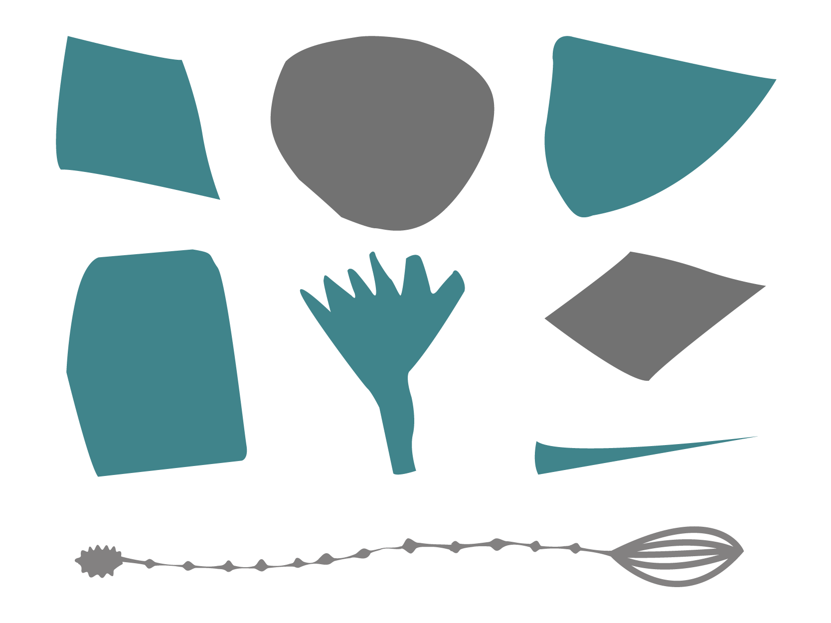
Shapes
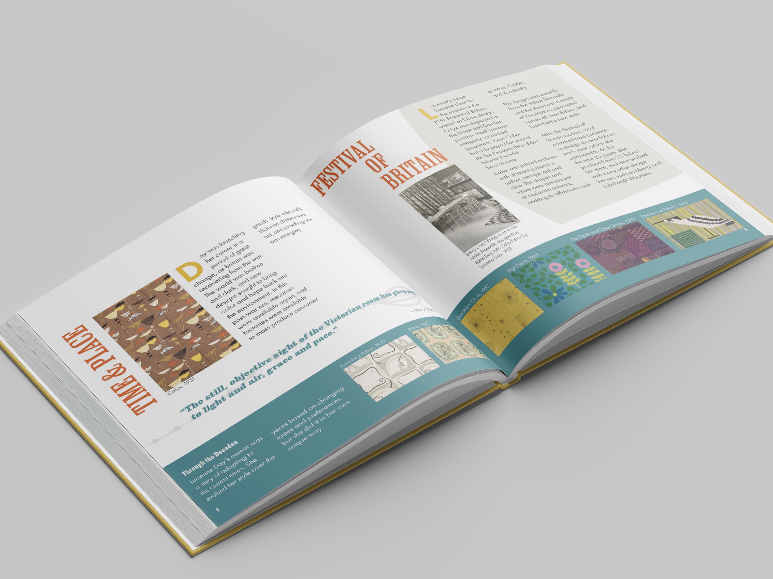
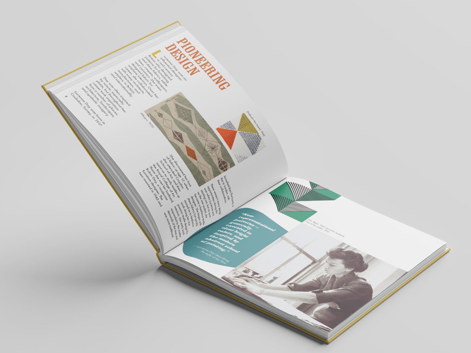
Layout


Concept
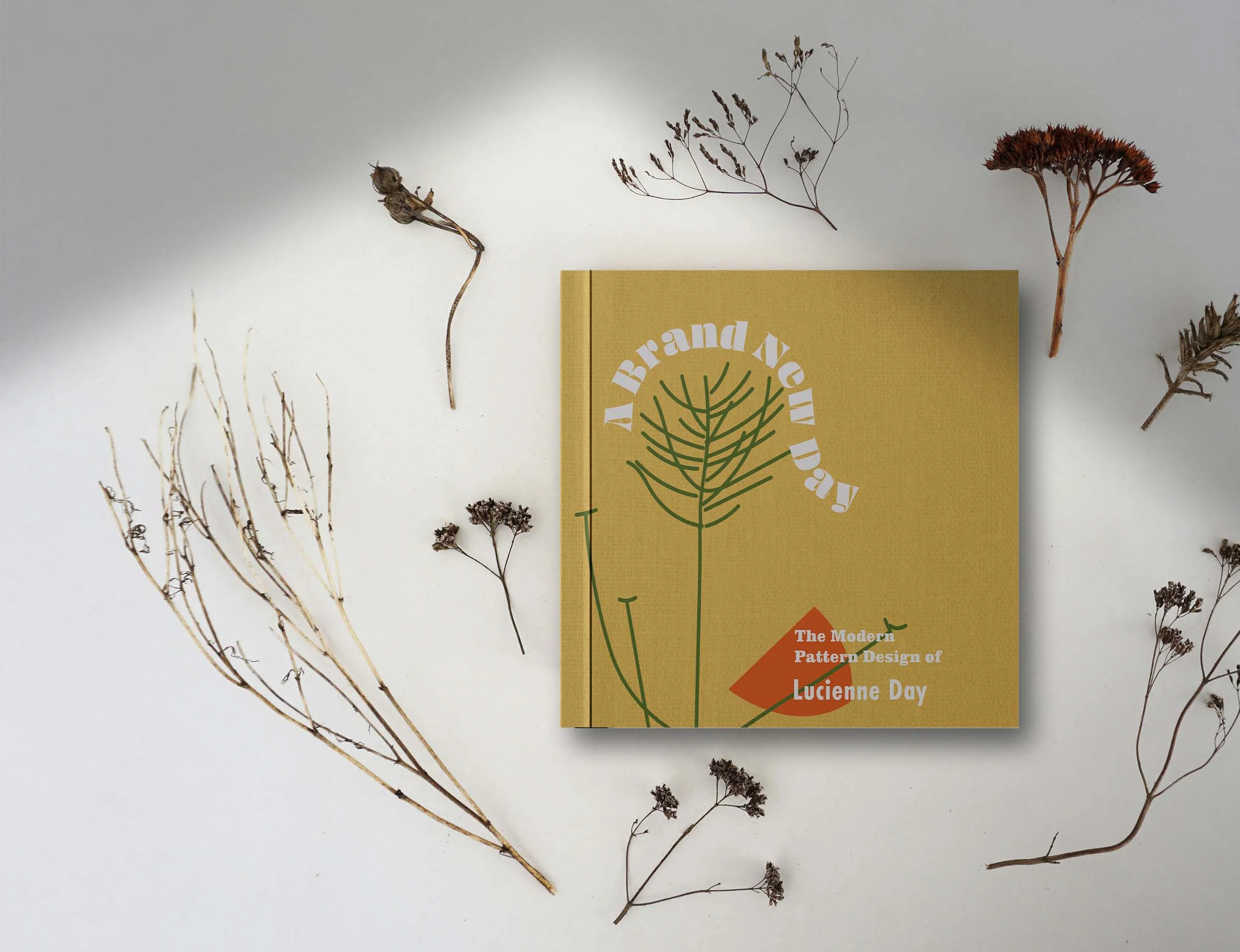
“A Brand New Day” is a light and varied, easy-to-read showcase of images of Lucienne Day’s work, upon the backdrop of shapes from her designs, fabric textures, and natural elements. It evokes mid-century spaces, without being stuck in the past.
The final book uses shapes and concepts from Lucienne Day’s body of work as a backdrop for her designs to be showcased. Samples of her work are laid out as if they were scraps of fabric laid out for sewing. Fabric textures are balanced with white space for a sense of openness and lightness. Text box shapes are taken directly from shapes in Lucienne Day’s work. Yellow is one of the primary colors because it was prominent in Day’s work and represents mid-century optimism. The other colors are also from her work, as they were common in that time period. I took inspiration from nature in some of the heading text and in some of the floral shapes.
Keep scrolling to see styles and portions of the design, or click the button directly below to view the whole booklet.
Keep reading to learn how I translated Day’s work into a book layout
Brief
Lucienne Day began working as a designer in 1939, and she became famous in England in 1951. She pioneered the British mid-century modern interior design style and was famous for her interior textiles, dress fabrics, carpets, wallpapers, and ceramics.
My goal was to reflect mid-century modern aesthetics, which Lucienne Day pioneered, but to keep it contemporary to the 2020s, since she was always looking to the future. It was important to include some elements of nature, as she would have done, and to use elements of her designs. I wanted to make the text easy to read and keep each spread engaging, to entice the reader forward.
Research Insights
In researching Lucienne Day, I found she was always evolving, trying new techniques and changing her style to adapt to the era she was working in. The one thing that stayed constant was her goal of making designs that were practical for everyday use.
A quote that stayed in my mind while designing was a description of the mid-century modern period by another pattern designer of the time, Marion Mahler: “the still, objective site of the Victorian room has given way to light and air, grace and pace”. Post-war light, brightness, and optimism were important to my design.
Moodboard
Sketches
Digital Drafts
Challenges
Paring down what content I would include. I didn’t want to overwhelm the reader with too much information and I wanted to leave white space for the designs to breathe. I pared down the images by choosing work from different eras and not including work that was in a similar style to other work.
Photo resolutions. This book was a school project and not an official publication, therefore I couldn’t always find photos that were the appropriate resolution for printing. I resampled some photos, and eliminated some that were not high resolution enough. If this had been going to publication I would have been careful to only choose high res images.
Texture. I received advice to add more texture to the book. The cover had fabric texture but the inside was flat. I decided to add texture to existing shapes and keep the opacity very low, to keep the focus on the images and not distract from the text.
Reflection
I’ve always loved fabric and patterns, and wondered about the people and processes behind the surface patterns I collect, so this was a wonderful way to immerse myself in that world. It was a fun way to play with shapes and a variety of layouts. I realize the variation of text and image placements in this layout would not work for every project, but it gave me good practice in flowing text with InDesign and I gained an understanding of the time it takes to place each element of a layout so that everything stays in balance. In the future I want to think more about how the spreads flow into each other, so that when you look at all the pages next to each other there’s a clear direction.


